Evaluating Spatial Accessibility to Healthcare Facilities in Glasgow: A GIS-Based Analysis Using the Two-Step Floating Catchment Area (2SFCA) Method
Explore the MapThis webpage is part of the deliverables for the MSc Project at the College of Science & Engineering, University of Glasgow.
This is an application-oriented MSc project under Theme P: "Bringing the field to your desktop: Accessibility-focused spatial analysis and visualisation of GES field course locations and activities." The study area and research focus have been slightly modified based on personal interest, with changes approved after discussion with supervisors. The webpage and its web map component were developed with the assistance of W3Schools and Mapbox tutorial examples. The code has been modified where necessary.

Figure 1: University of Glasgow
As Beks et al. (2021) suggest, "Access to health care is a universal human right and a key indicator of health system performance." However, accessibility should not be evaluated solely based on Euclidean or network distance. It is also influenced by factors such as local population density and the capacity of healthcare facilities. To account for these complexities, this project adopts the Two-Step Floating Catchment Area (2SFCA) method rather than relying exclusively on service area analysis. As the largest city in Scotland, Glasgow features a complex and uneven population distribution, with varying levels of healthcare demand and infrastructure across its neighbourhoods. In such an urban context, spatial accessibility plays a critical role in shaping health outcomes and supporting equitable healthcare planning.
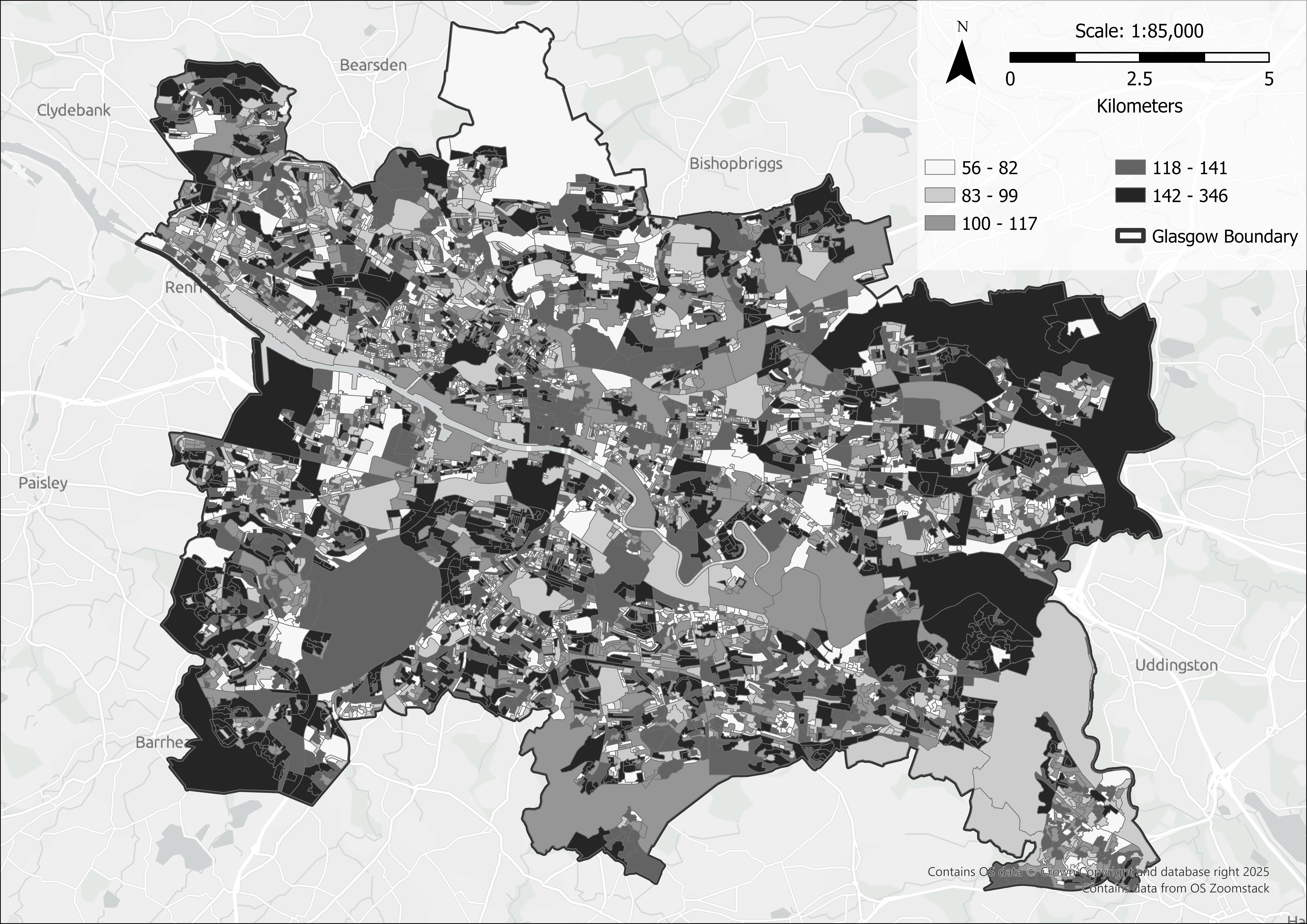
Figure 2: Glasgow Population by Output Areas (OAs), 2022
Data used in this project were fully collected online from a variety of sources including government mapping agency, government open portals, open geodatabase, etc. Below is the summary of the key data used in the project:
A range of software applications was used during the development of this project:
Healthcare facility data used in this project were sourced from the NHS website as of June 2025. Hospital capacity information was extracted from a database containing 30,221 records using basic SQL queries (Fig.3). Due to the limitation of 1000 origins and 1,000 destinations in Arcgis Pro network analyst, neighbourhood blocks were merged based on the first part of the postcode combined with the first letter of the second part (Fig.4). All layers were then imported into GIS software and reprojected to the correct coordinate reference system.
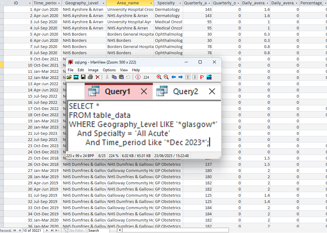
Figure 3: Extracting Glasgow Hospitals Bed Numbers
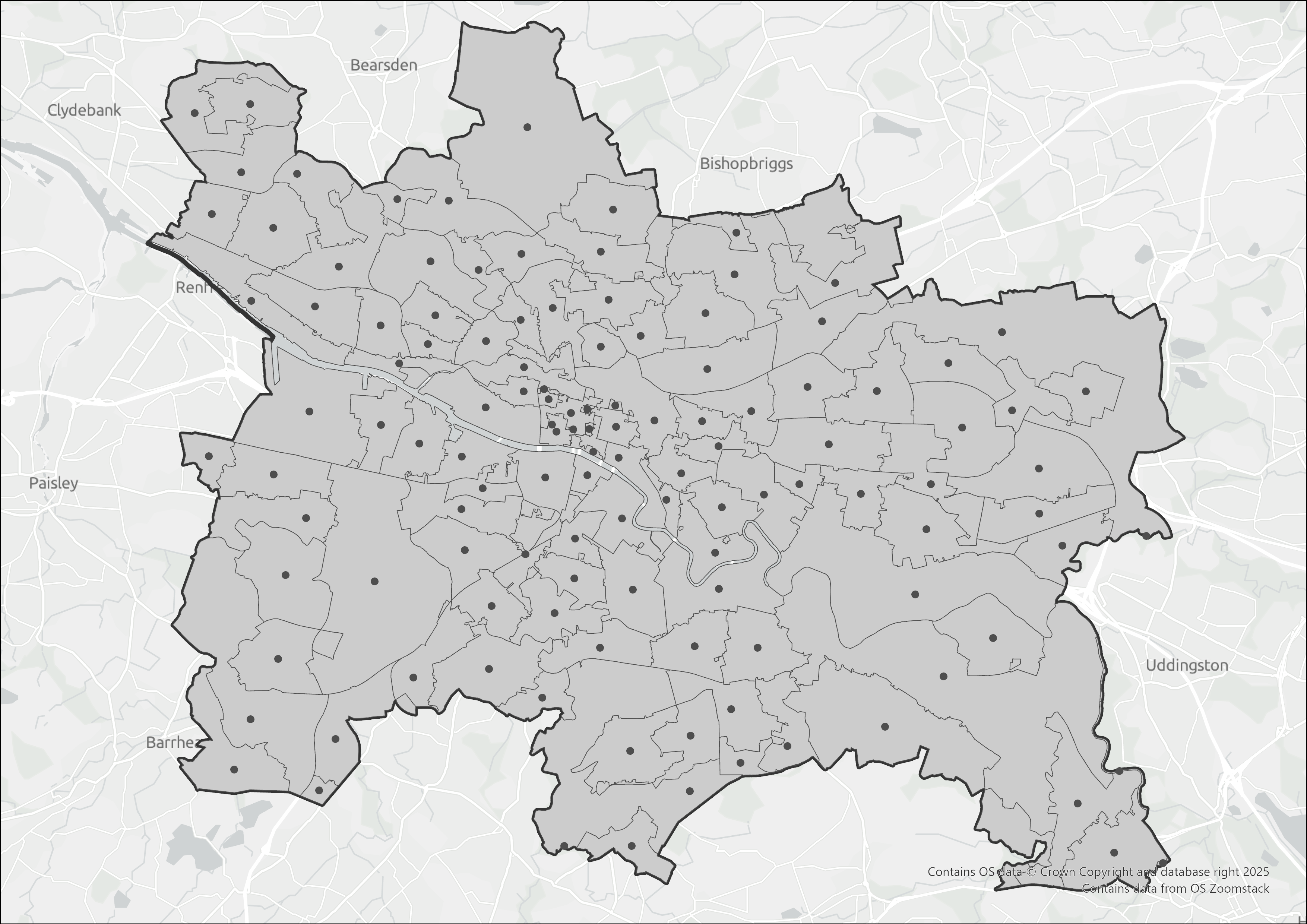
Figure 4: Glasgow Neighbourhood Blocks Based on Postcode
Service areas were generated using ArcGIS Network Analyst based on two travel modes: 10 minutes for driving and 20 minutes for walking. output of the Origin Destination (OD) Cost Matrix Solver were used to identify which neighbourhood block centroids fell within each hospital's service area.
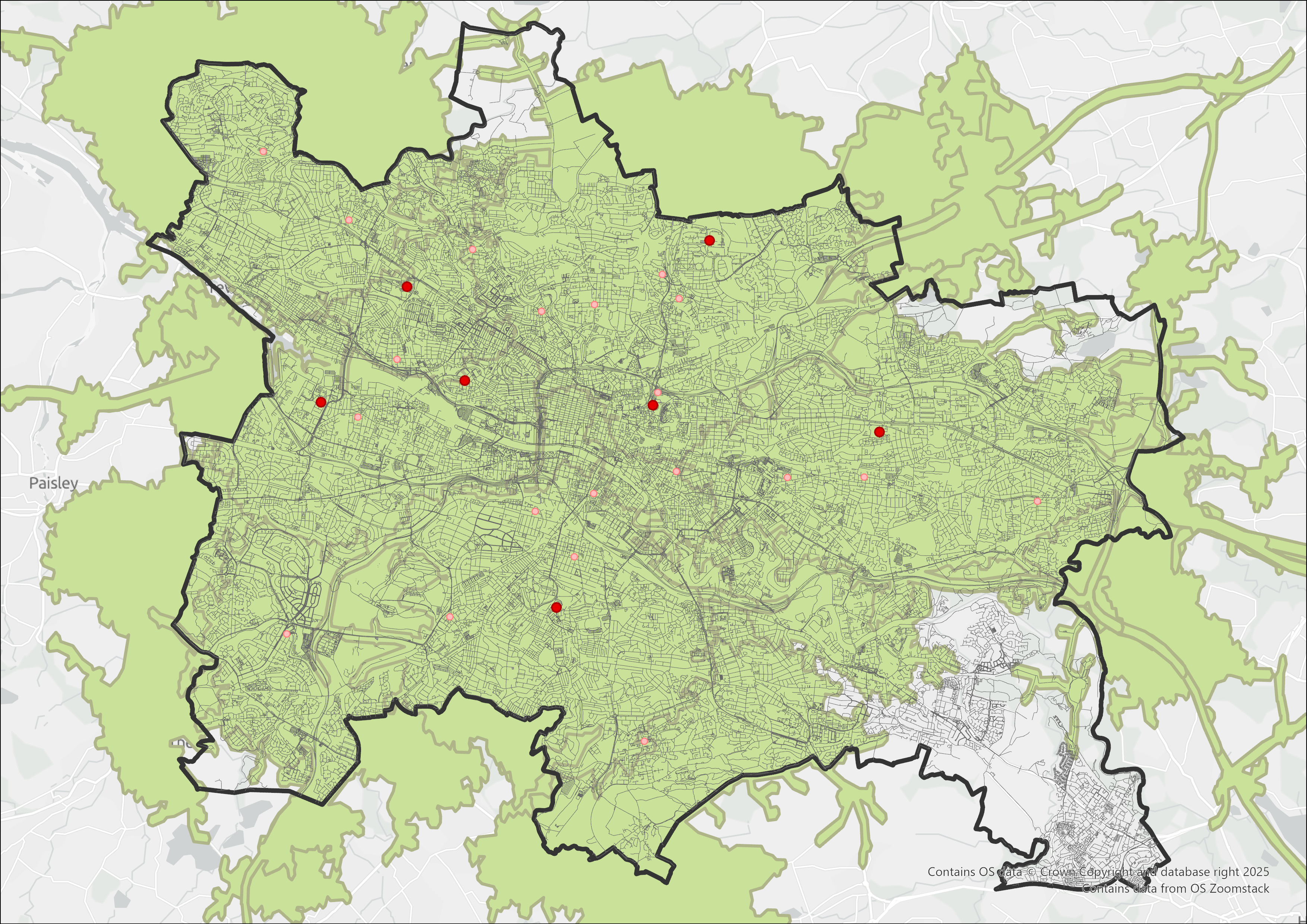
Figure 5: 10-Minute Driving Service Area
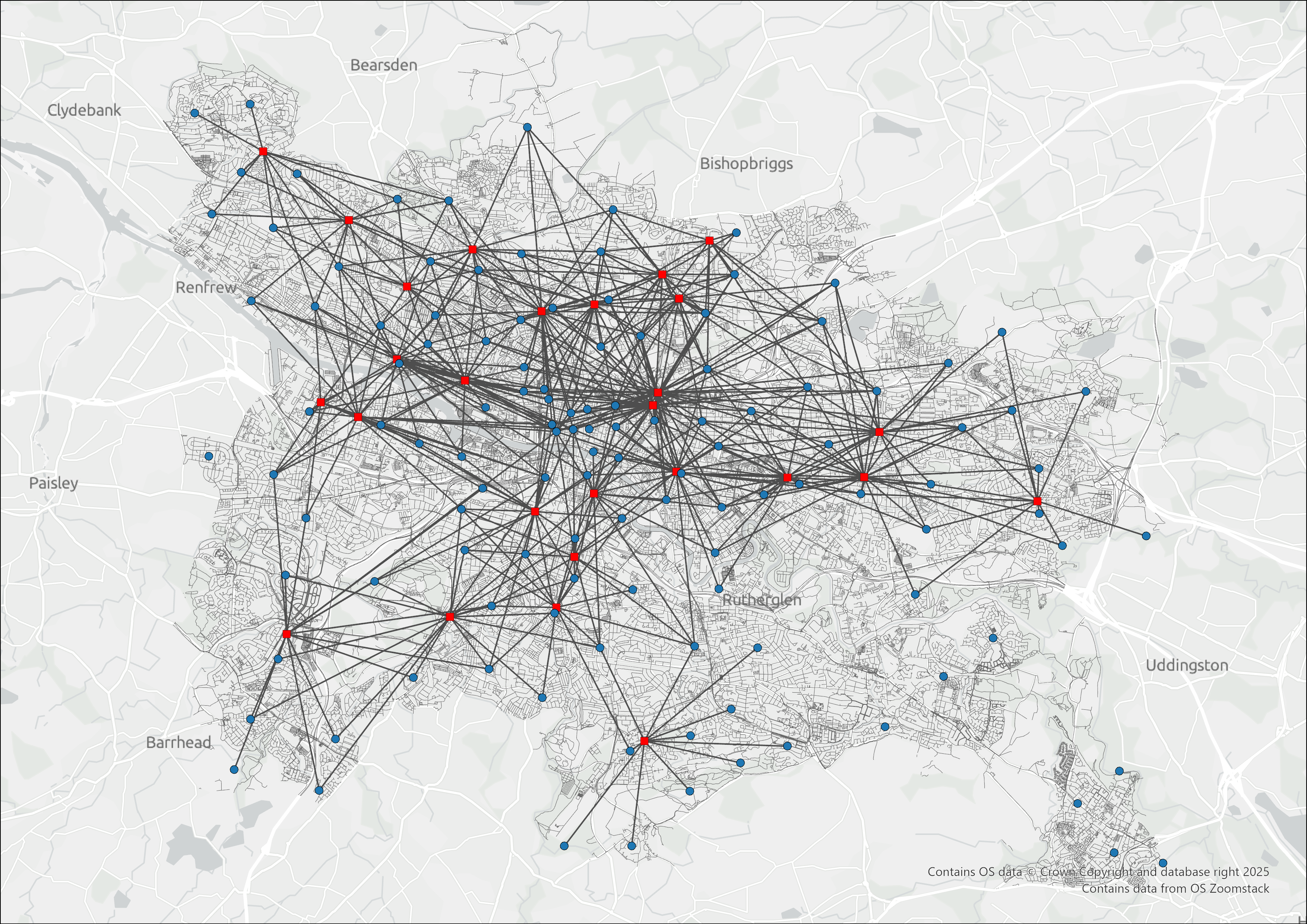
Figure 6: OD Cost Matrix Output (Driving Mode)
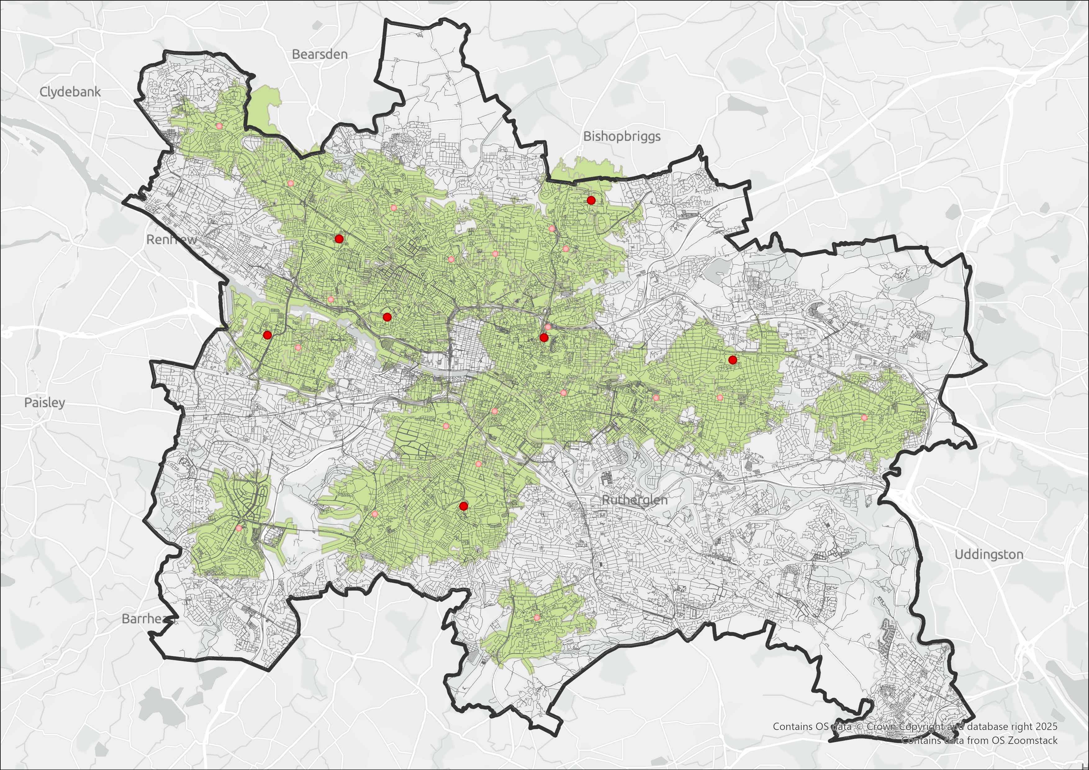
Figure 7: 20-Minute Walking Service Area
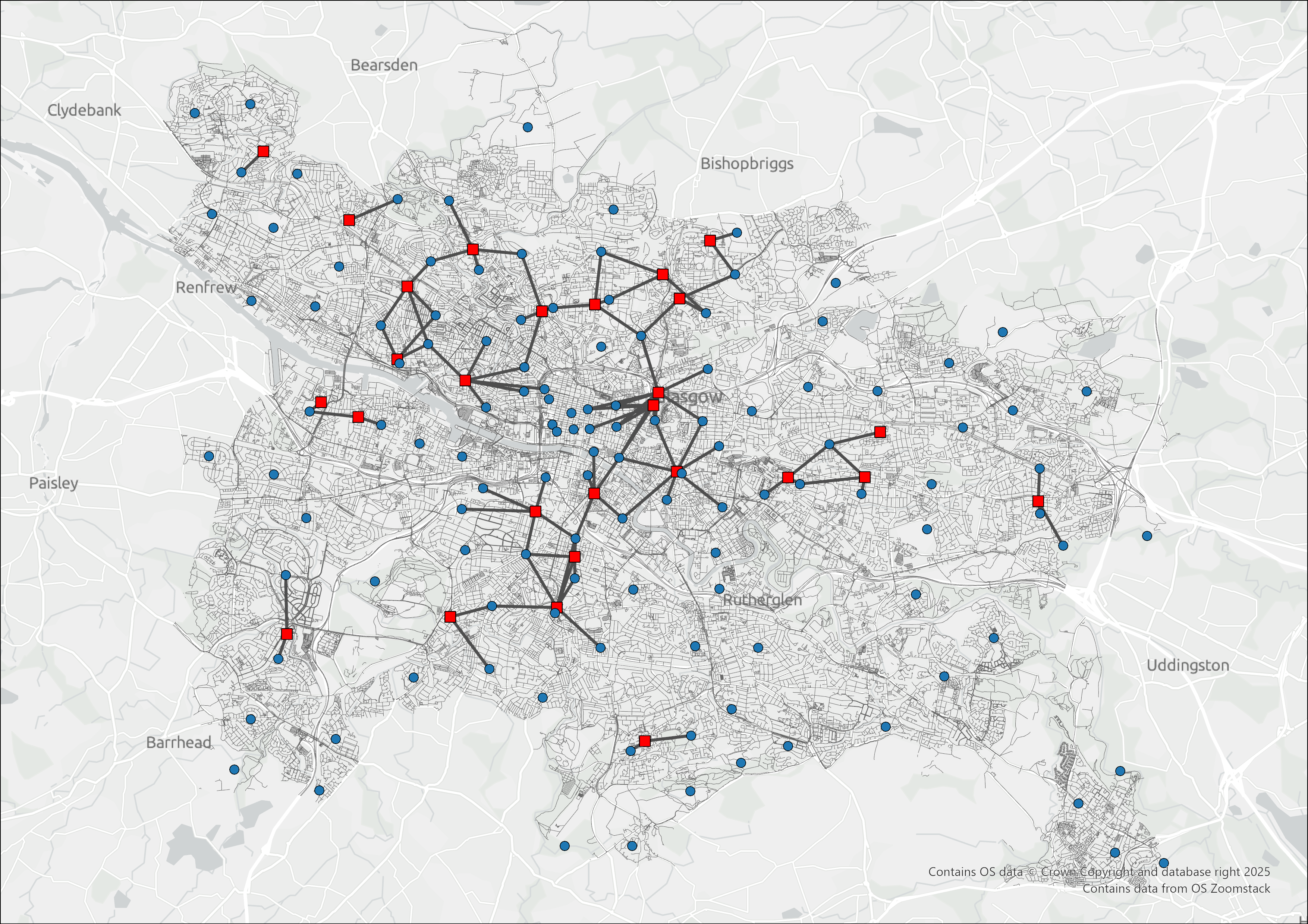
Figure 8: OD Cost Matrix Output (Walking Mode)
The Two-Step Floating Catchment Area (2SFCA) method was used to assess spatial accessibility to healthcare facilities. In the first step, a supply-to-demand ratio was calculated for each facility by dividing its capacity by the total population within a defined catchment area (e.g., 10-minute drive or 20-minute walk). In the second step, these ratios were summed for each neighbourhood centroid based on the facilities accessible within its own catchment area.
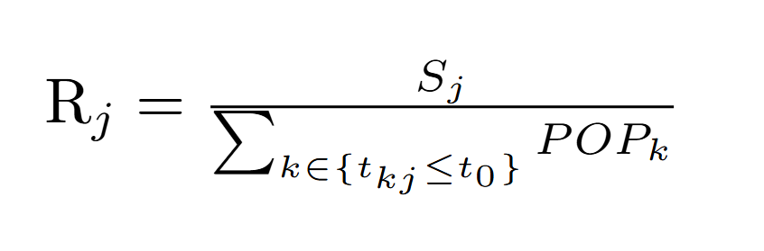
Figure 9: Calculating Supply to Demand Ratio
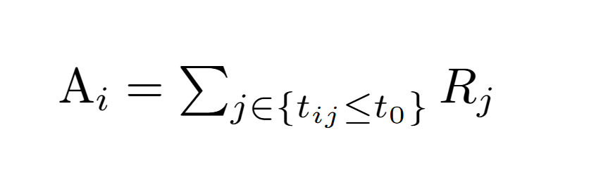
Figure 10: Calculating Accessibility Level at Each Demand Location
To meet the cartographic requirements, a customized basemap was created by modifying the monochrome template provided by Mapbox. Labels, parks, and water bodies were added using light colours to enhance the map's informational content while maintaining a clean and consistent colour theme. Each layer and feature uses unique colors or icons, and legends along with a full-screen view function are provided to improve readability and enhance the overall user experience.
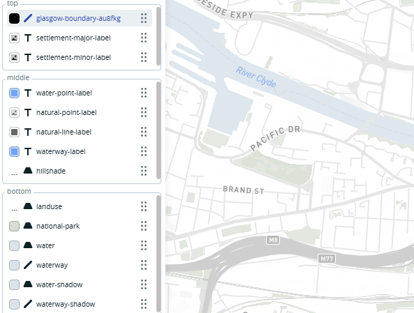
Figure 11: Mapbox Basemap Customization
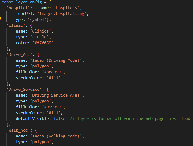
Figure 12: Cartographic Styling of Mapbox Layers
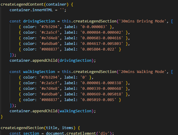
Figure 13: Design of Legends in Mapbox